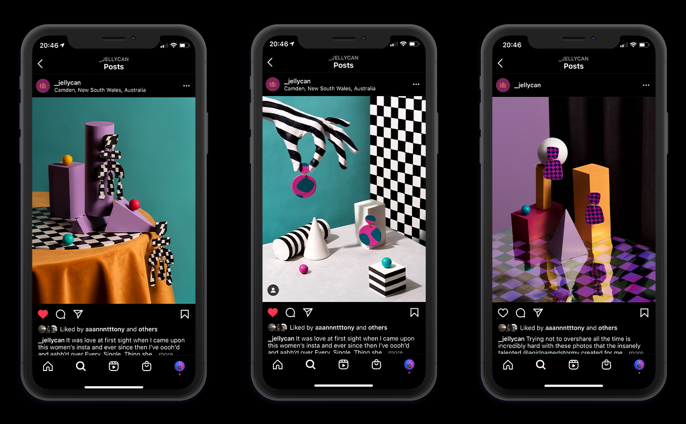
A SURREAL & BOLD WORLD OF HANDMADE EARRINGS
INTRODUCTION
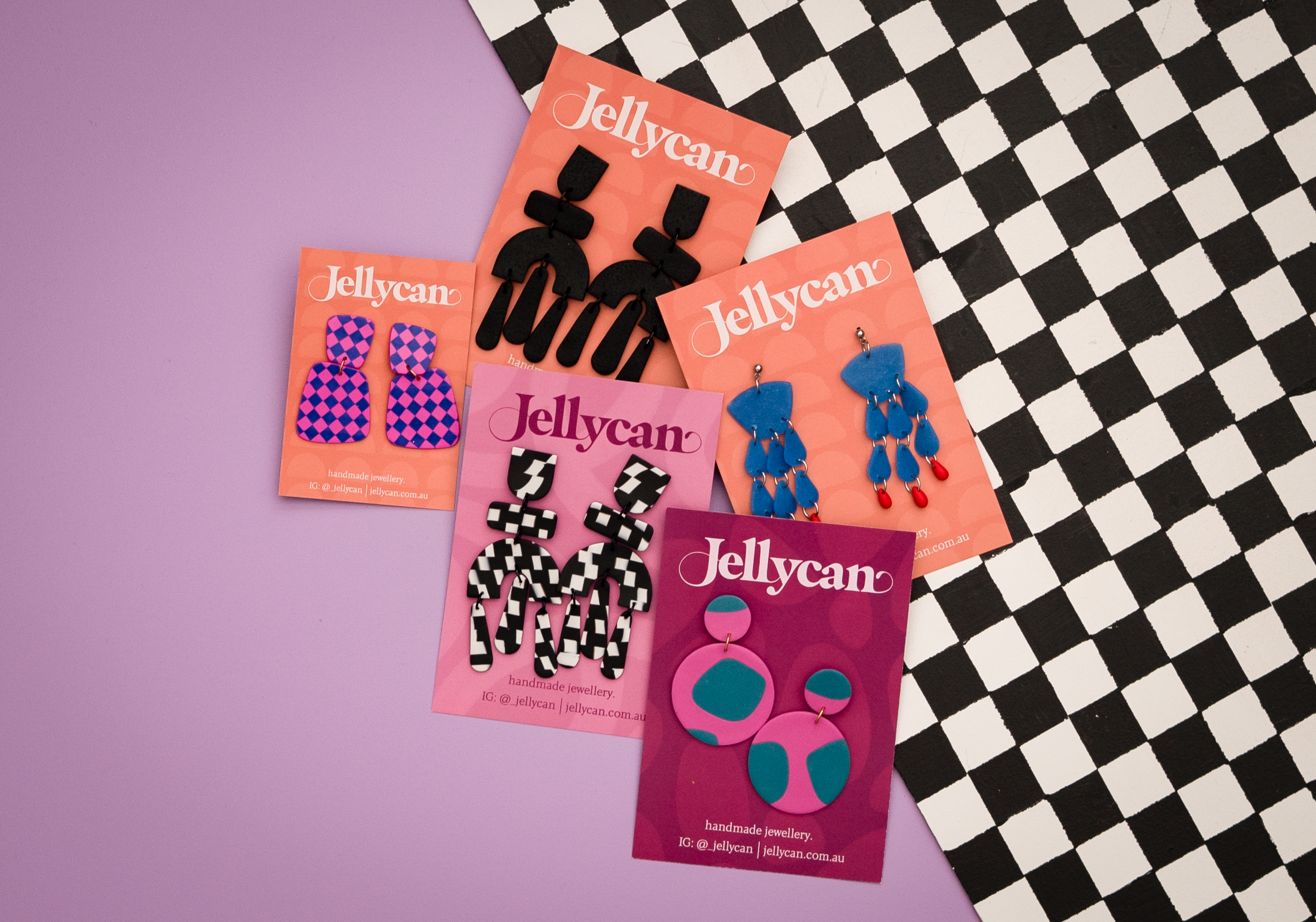
In 2018, Jelena (AKA Jellycan) began designing earrings out of her home in Camden, New South Wales. She developed a bright, bold and quirky style that the people of Camden have come to love. Her work is sold in local galleries and retail spaces but she is soon to launch her first website and grow her customer base.
Expanding beyond the local market can be intimidating, especially when resources like Instagram are so competitive and full of talented earring designers like Jelena. My goal was to create a cohesive body of invigorating images that can be used for social media as well as traditional street advertising. I wanted these images to reject the current photography trends of Jelena’s competitors; in the same way, her earring designs do.
The most exciting part about this project was where Jelena was on her journey. When I created these images, she had just barely past 1,100 followers on Instagram. A humble number, allowing us to take bold risks, embrace weirdness and imagine what Jellycan could be.
Jelena resigned control over this project, allowing me to have full creative authority over the imagery and from conception to completion.
THE MISSION
Make a series of images that challenge the trends of jewellery photography, and increase the visibility of this fun-loving handmade earring brand.
THE OUTCOME
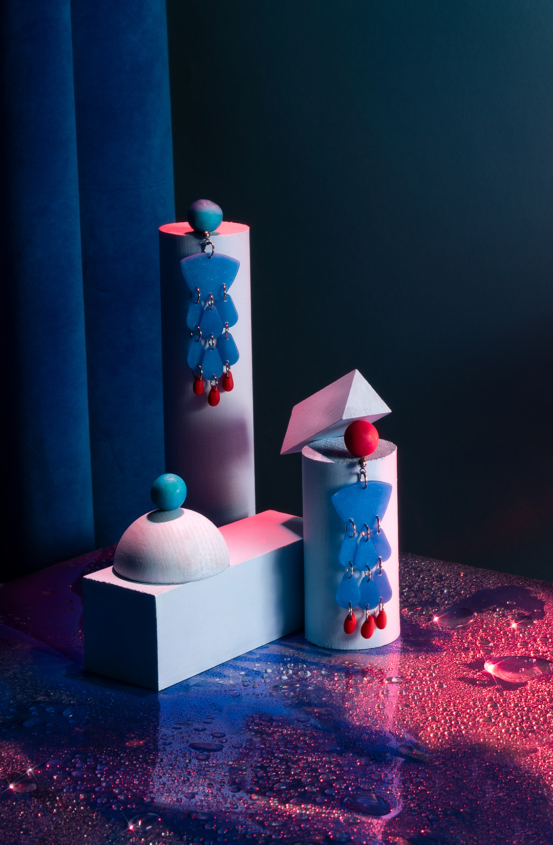
Six bold product images drawing inspiration from surrealism to be used for marketing materials and social media.
SERVICES
Art Direction / Concept Development / Prop & Set Design / Studio Lighting / Photography


THE PROCESS
PRE-PRODUCTION
![]()
Exploration and research is the most important part of any project. My aim was to understand Jellycan’s audience and define a visual photographic language for the brand. I began my research by exploring Pinterest for “earring photography” and was surprised to discover a lack of diversity and imagination in the shots that I found. On first glance, I would have believed them to all be from the same jewellery company. Beige colours, crisp shadows and pretty young models were a theme across all the images.
![]() *Researching “Earring Photography” on Pinterest. The images all had a similar minimal style that I wanted to avoid.*
*Researching “Earring Photography” on Pinterest. The images all had a similar minimal style that I wanted to avoid.*
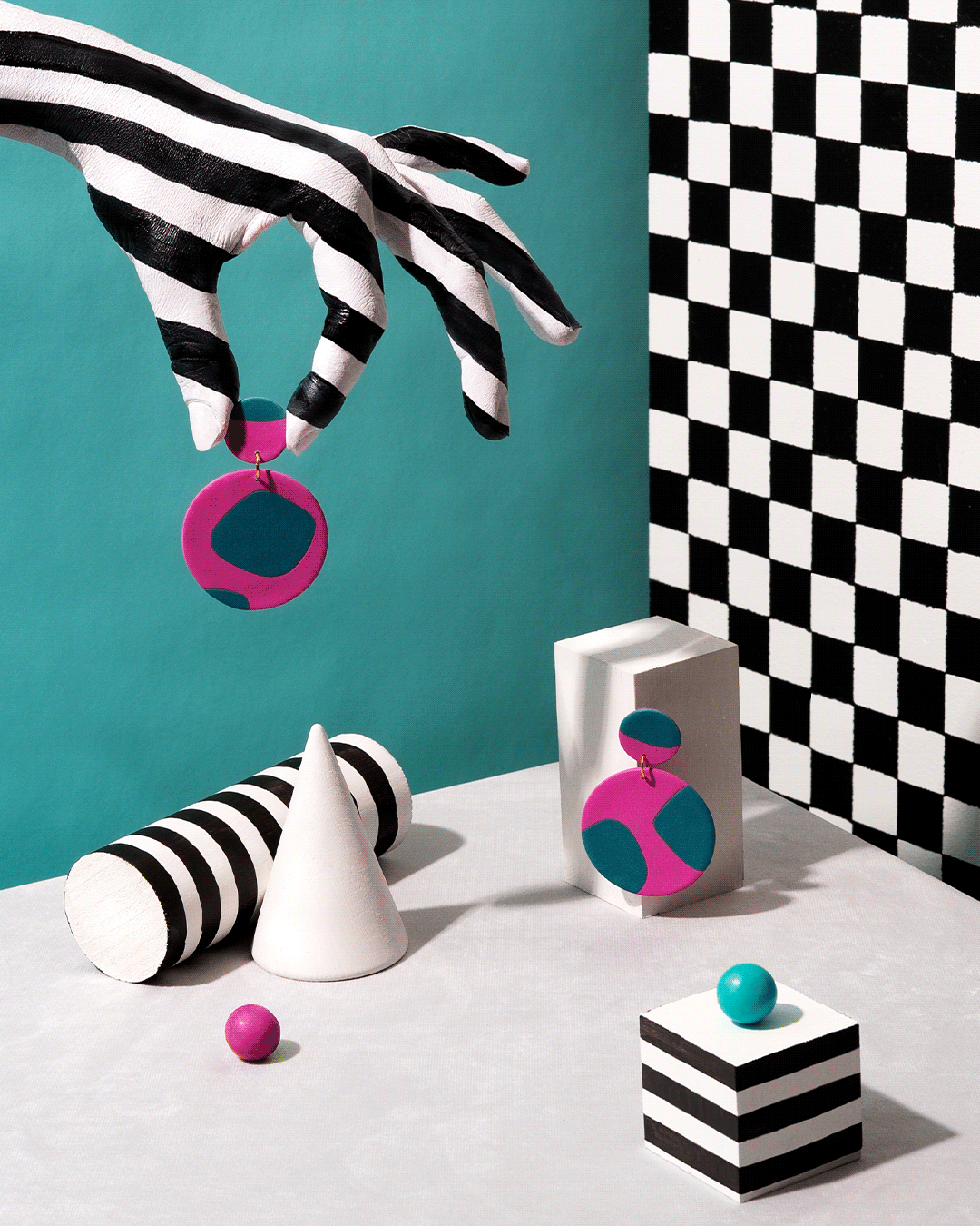
Jellycan is a playful, fun-loving brand. So I asked myself “What can I do that is totally opposite to these images here? What props and colours can I use that say-‘I am a fun-loving handmade earring brand’?” My discovery: bright colours and body paint.
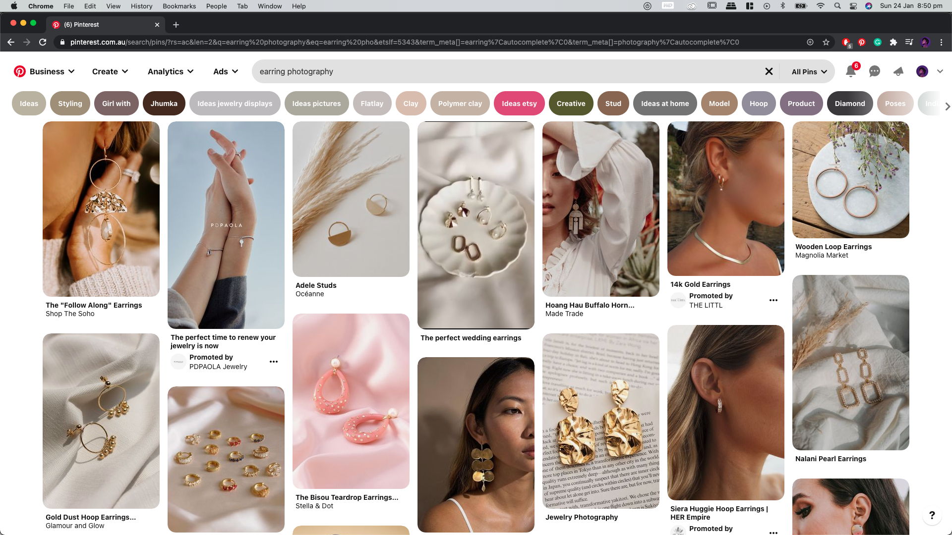 *Researching “Earring Photography” on Pinterest. The images all had a similar minimal style that I wanted to avoid.*
Jellycan is a playful, fun-loving brand. So I asked myself “What can I do that is totally opposite to these images here? What props and colours can I use that say-‘I am a fun-loving handmade earring brand’?” My discovery: bright colours and body paint.
PROCESS / PRE-PRODUCTION
THE FIRST (FAILED) CONCEPT
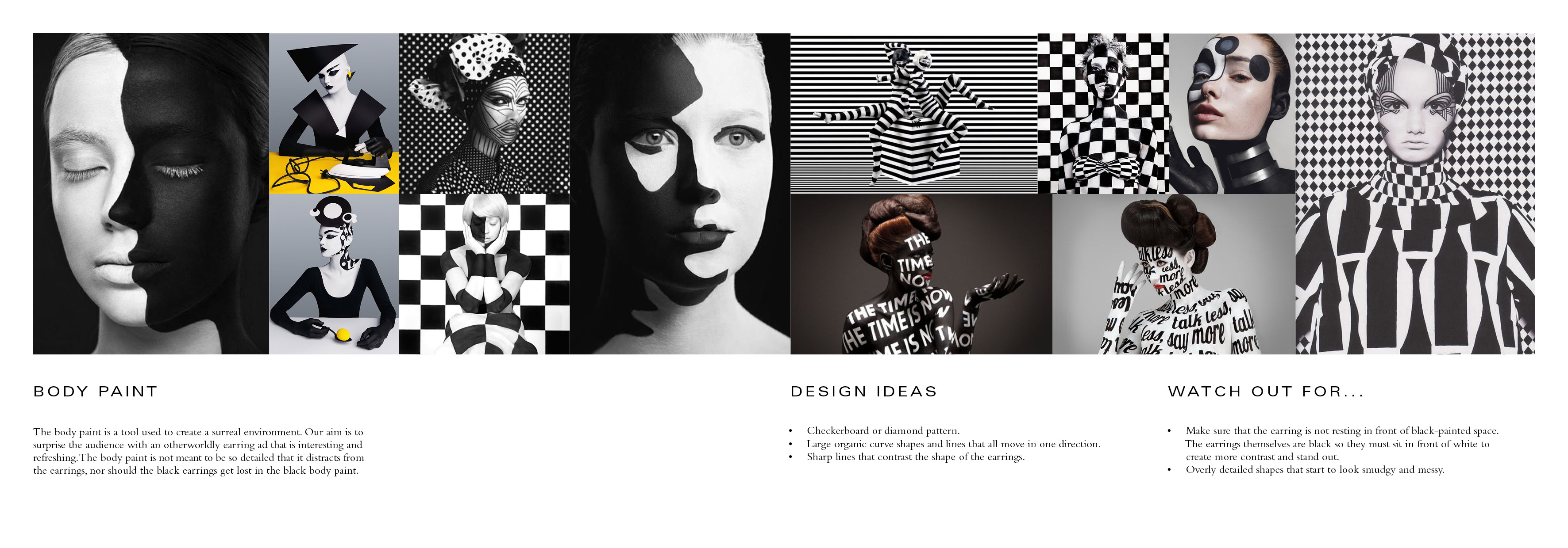
My first concept was to paint geometric patterns on a model who is wearing Jellycan earrings. To better envision this, I created a mood board exploring the geometric body paint and used this as a reference when painting my own body to create a prototype image. I quickly discovered that this concept was too serious and would likely work for another company but was not appropriate for the style of earrings, the Jellycan brand or her audience.
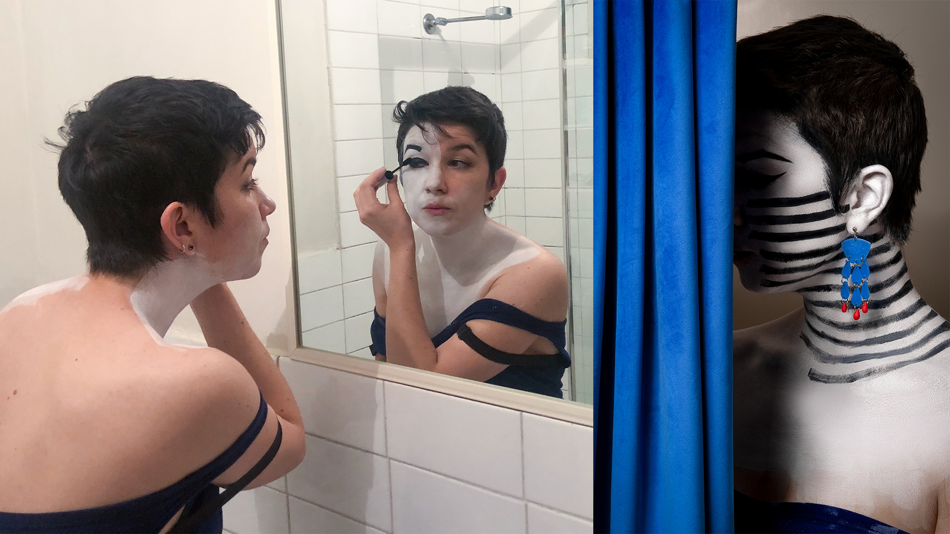 *Above- painting myself to prototype the body paint concept which I eventually abandoned*
PROCESS / PRE-PRODUCTION
FINAL CONCEPT DEVELOPMENT
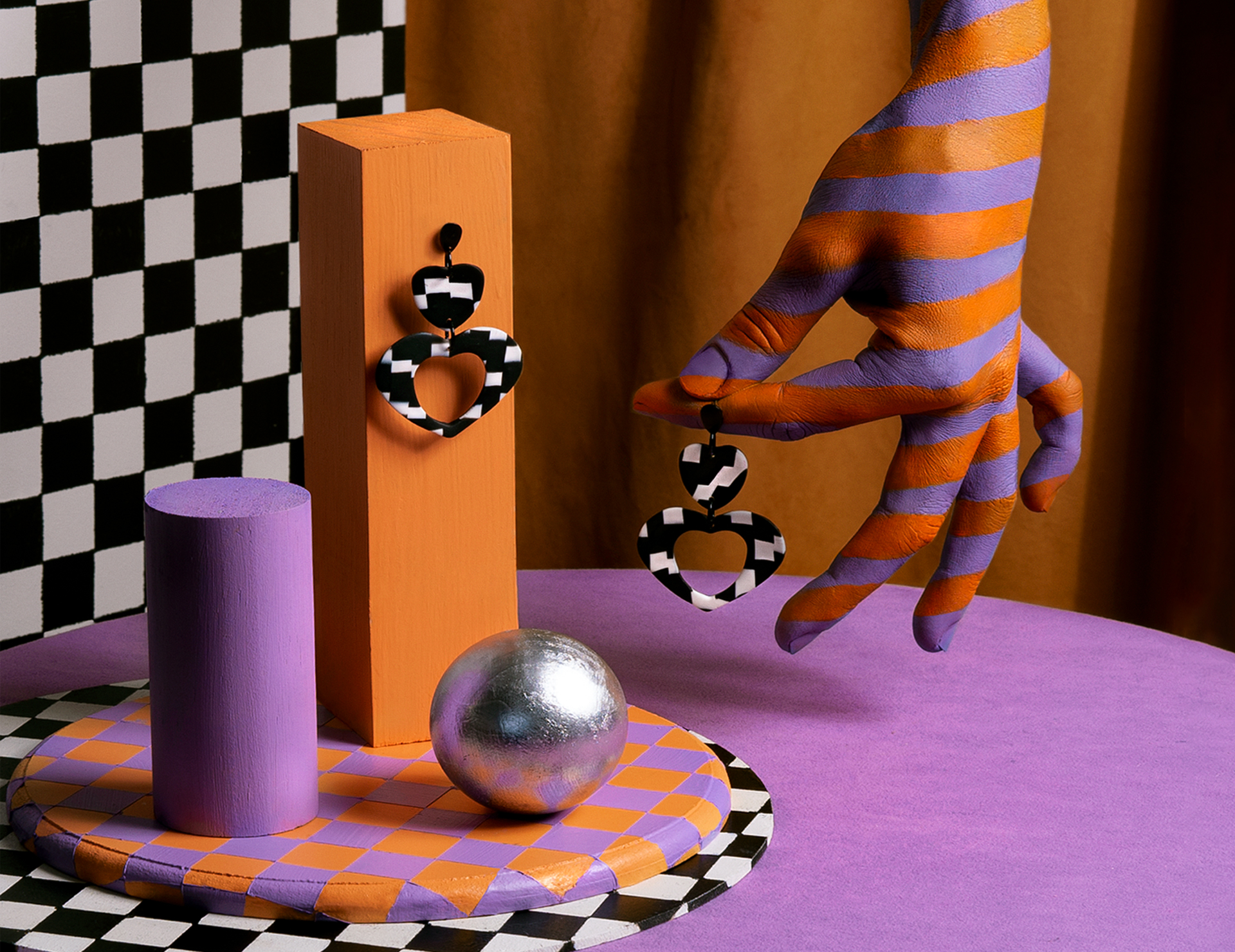
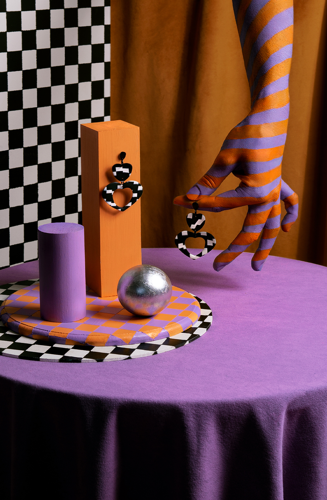
After taking a day off to recharge, I went back to the drawing board and developed a new concept inspired by simple geometric shapes and the classic art school drawing exercise. The plan was to display the earrings on the geometric shapes and create compositions that use leading lines to loop the audience's eyes around the image. Even though the bodypaint concept didn't work on the model, I decided not to abandon the idea entirely. The best way to use this effect was to paint my own hand and have it interact with the surreal geometric world I envisioned.

PROCESS / PRE-PRODUCTION
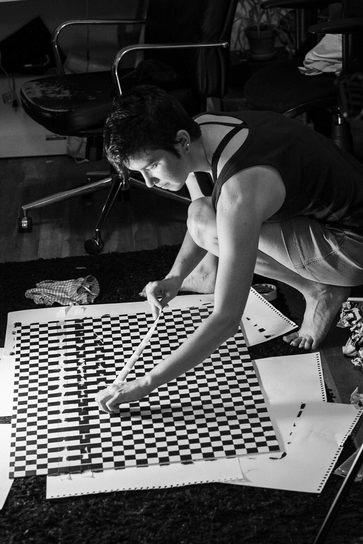
PAINTING & PROP PREPARATION
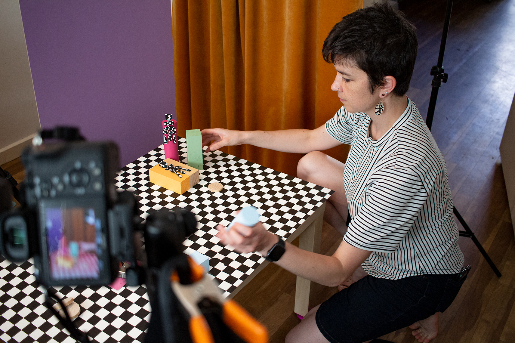
After researching and finalising the concept, I moved on to prop sourcing, painting and set building. This project required me to source a versatile set of props. For example, painting a checkerboard flat which was used as both a wall and as a floor. I hand-painted a combination of cylinders, cubes, and flats which all contrast in shape size and colour. I styled and shot a prototype image to test out the lighting and played with a few compositions.

PROCESS / PRE-PRODUCTION
"GIVE ME SIX HOURS TO CHOP DOWN A TREE & I WILL SPEND THE FIRST FOUR SHARPENING THE AXE."
- ABE LINCOLN
Pre-production is the most informative part of the process. It takes up about 50%-60% of the time it takes to make the project from start to finish.This is where I defined the direction of production and post-production, smoothing out any wrinkles in the concept, increasing efficiency and reducing my chances for error during production and post.

THE PROCESS
PRODUCTION
The mood boards, sketches and/or prototypes created during the pre-production stage lay out a clear path and plan for image creation. All props and elements needed for the shoot are in the studio ready for styling.

PROCESS / PRODUCTION
LIGHTING
Using my knowledge of product lighting, I decided one key light with a beauty dish modifier was needed. This created a blend of soft and hard shadows that were flattering and not distracting from the earrings. Bounce cards were used as fill lighting to bring back some of the details in the shadows.

PROCESS / PRODUCTION
STYLING
When styling, I pulled from my knowledge of still life composition and creating unity in images. Paying particular attention to the rule of thirds, avoiding tangents and the use of leading lines. I used the geometric shapes as these lines to direct the audience's eyes toward the subject and back around the page again. The aim was to create hypnotizing visual compositions capturing their attention for extended periods.
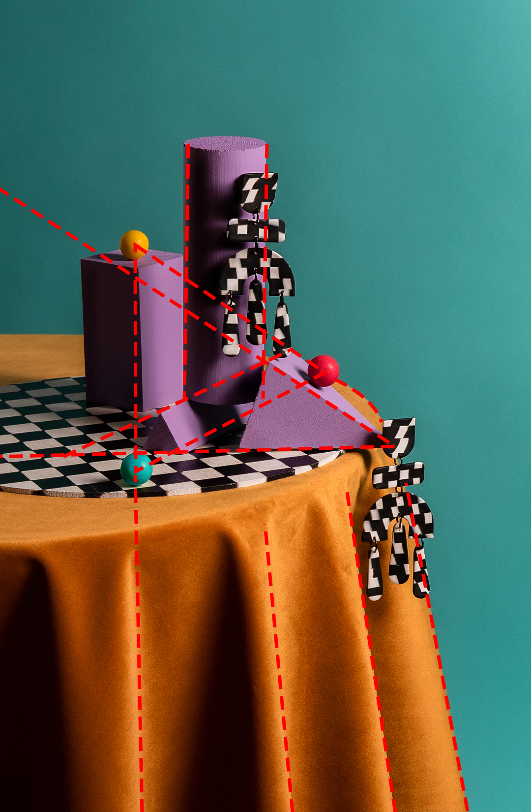

*Leading line diagram.
PROCESS / PRODUCTION
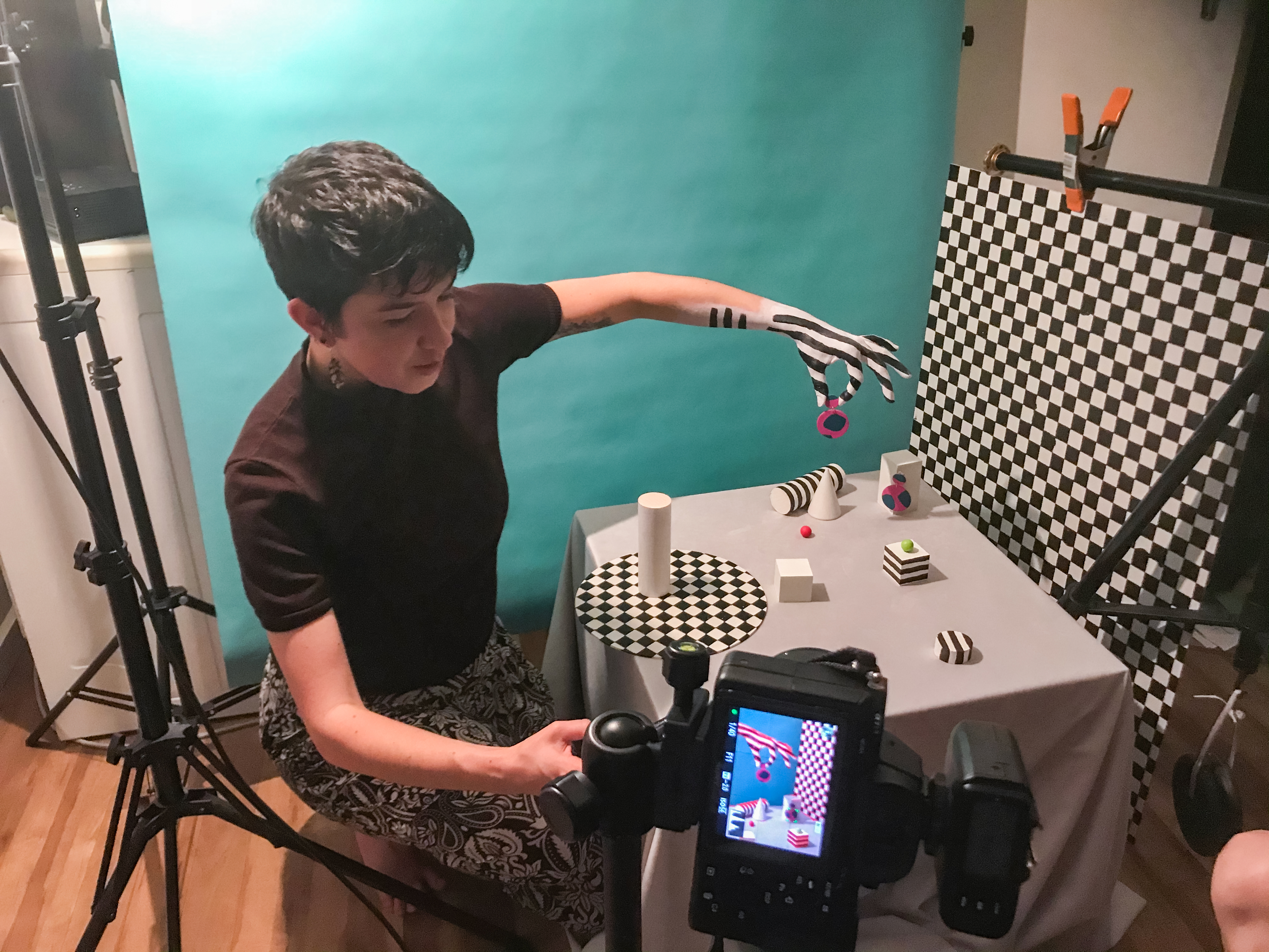
BODYPAINT
For this image, I referenced my mood board featuring some work by Jessica Walsh, an Art Director in NYC who has created several projects using body paint and geometric elements. I enlisted the help of my friend Sara (who is a painter) to assist in the painting of my hand. I offered direction and explained the effect I wanted. Sara then executed my request and recommended some alterations that improved the outcome. Watching her work taught me how to recreate this effect for another image and paint my hand myself.


THE PROCESS
POST-PRODUCTION
Post-production is the final step of the process. First, images are culled, organised and ranked leaving only the necessary files needed for editing. The retouching process begins with compositing, clean-up (clone stamping and healing) then basic exposure adjustments. It is then followed by dodging/burning, smoothing and colour grading. This process changes from image to image as does the time it takes to complete each image. I am able to achieve high-quality results due to my advanced understanding of image retouching and Photoshop software.
Need photography thats adventurous and creative? Don’t be a stranger. stormypyeatte@gmail.com