
“DOWNLOADING...” PRODUCT PHOTOGRAPHY FOR NINKA POP
INTRODUCTION
Ninka Pop is a statement accessory brand pioneered by Sayra Lopez, a queer Mexican designer based in Zurich, Switzerland. Ninka Pop is a rebel against mainstream minimal design with its punchy neon colours and fun custom graphics. The brand visual language is heavily influenced by the 1980s and vaporwave aesthetic which pulls references from Michelangelo, early internet graphics and tech. Each design is limited edition and the earrings are all handmade.
THE MISSION
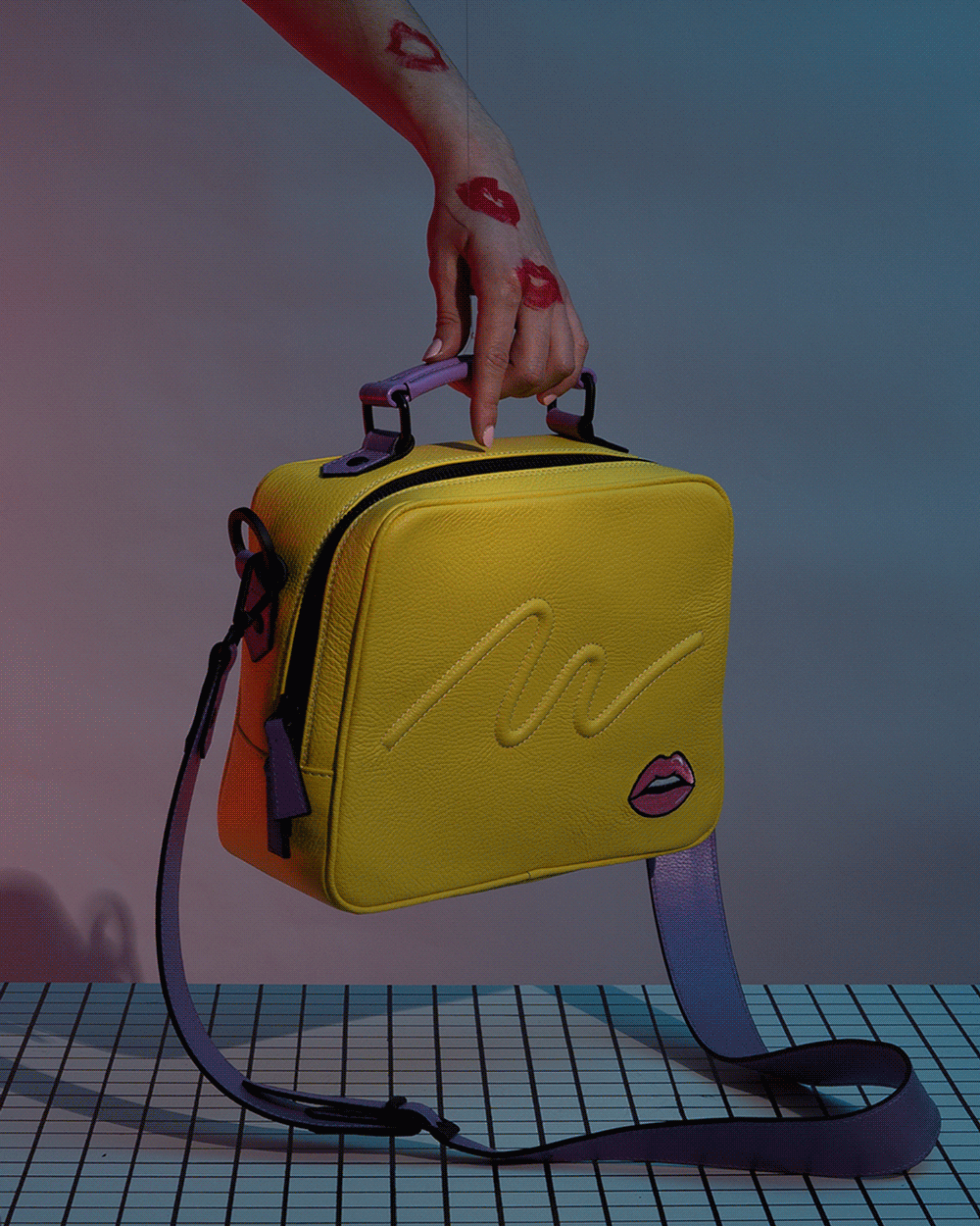
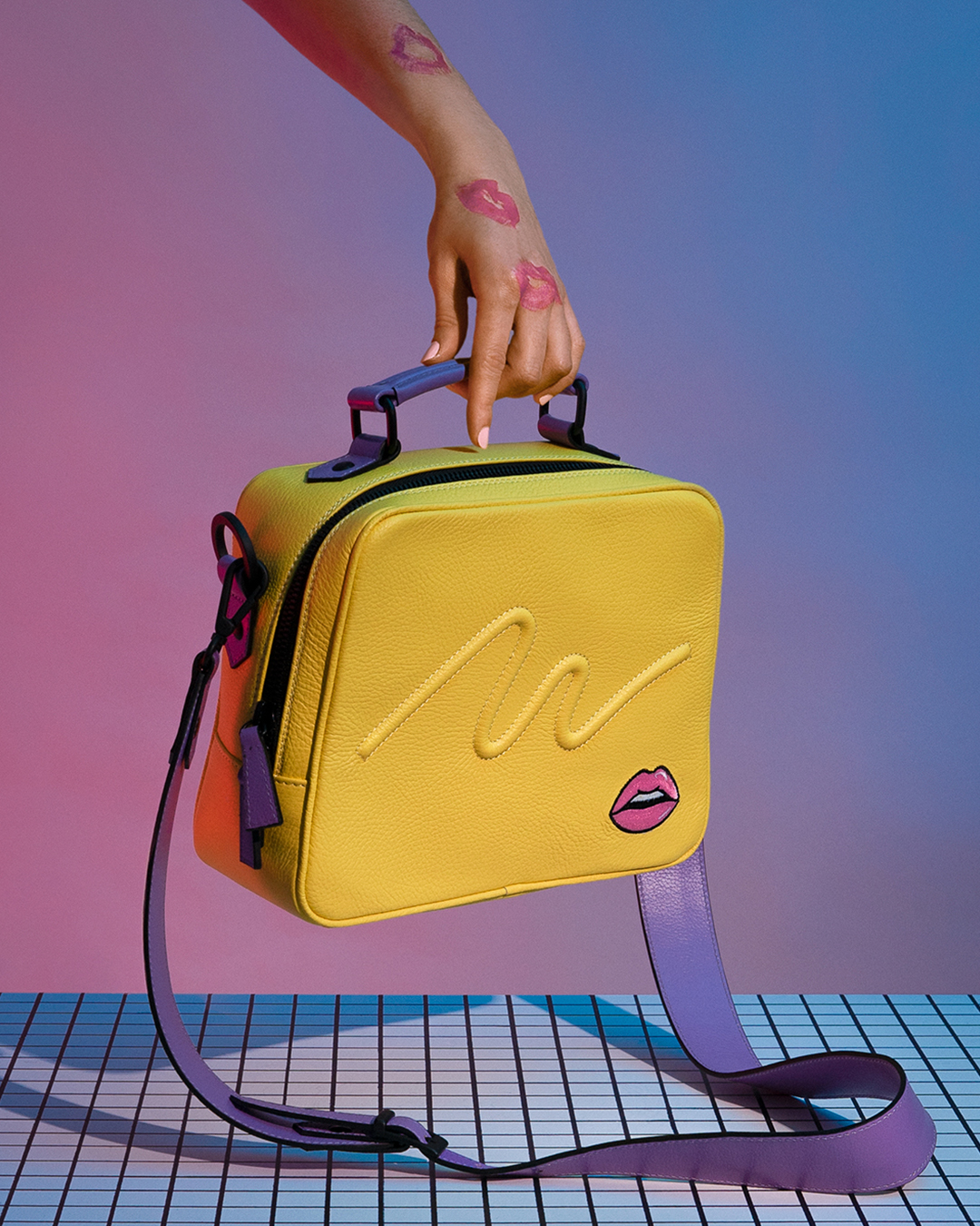
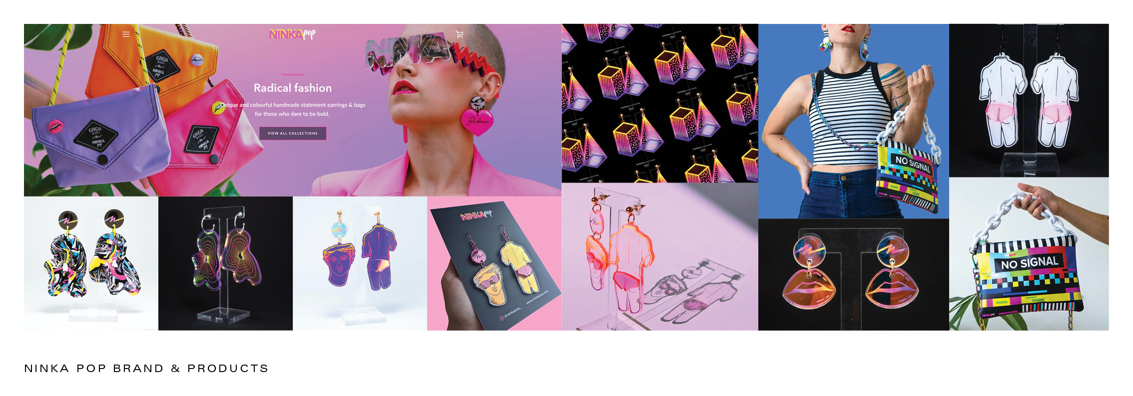
Sayra is known primarily for her bold handmade earrings, but has also begun designing bags. The yellow squiggle bag is a higher price point than her previous releases, because of this, it was decided an appropriate launch campaign was necessary with the support of high quality photographs and videos. My mission was to create a collection of images and short form video that further developed the vaporwave aesthetic of the brand while also celebrating her newest 80s inspired bag design.
THE OUTCOME
8 styled images and 2 videos to support Sayra in her self directed marketing campaign. These images were used on Instagram and facebook as well as paid internet advertising.
SERVICES
Art Direction / Concept Development / Product Photography / Videography / Prop & Set Design / Studio Lighting


THE PROCESS / PRE-PRODUCTION
RESEARCH & DEVELOPMENT
![]()
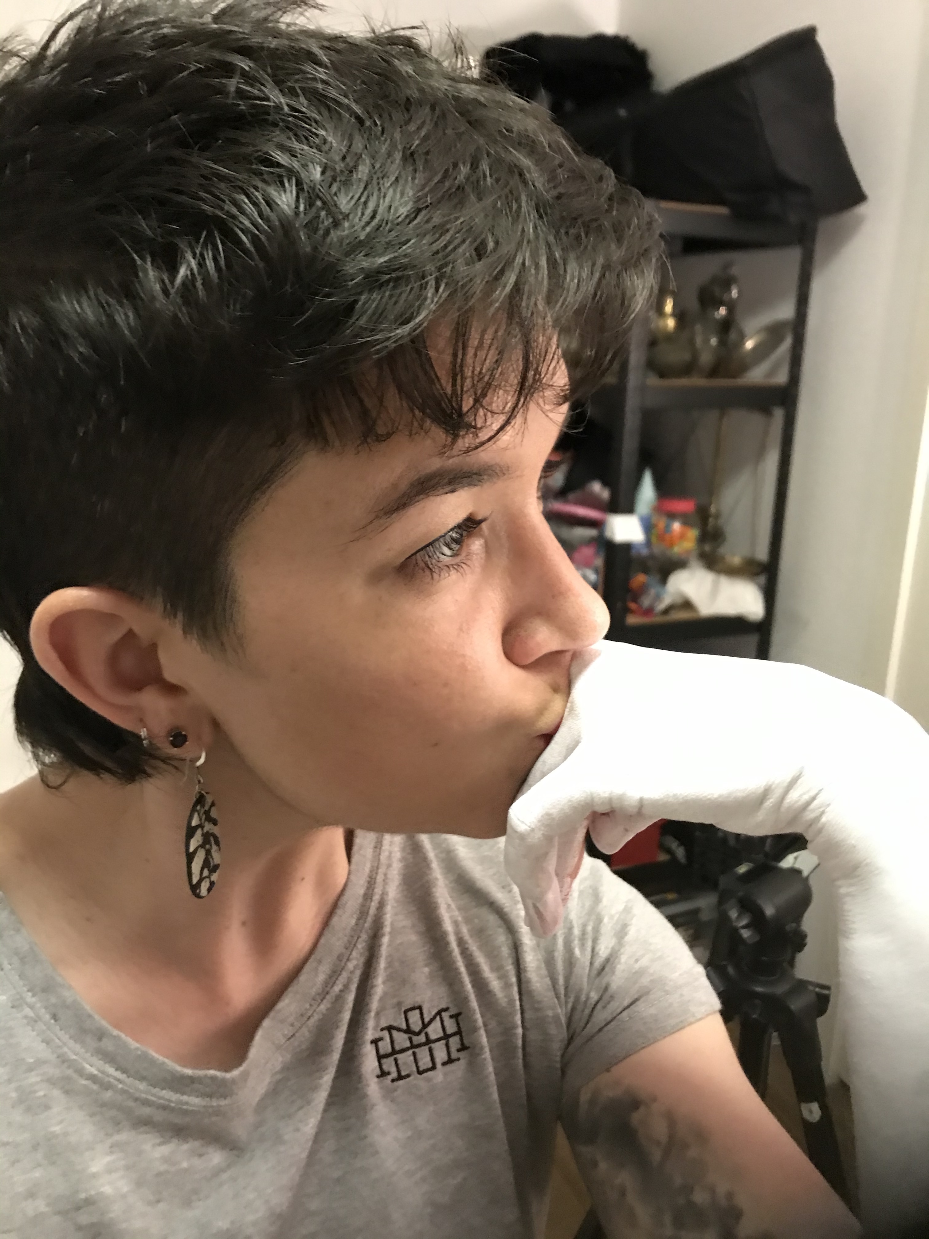
*Sayra Lopez, the designer behind Ninka Pop. Photo courtesy of Sayra.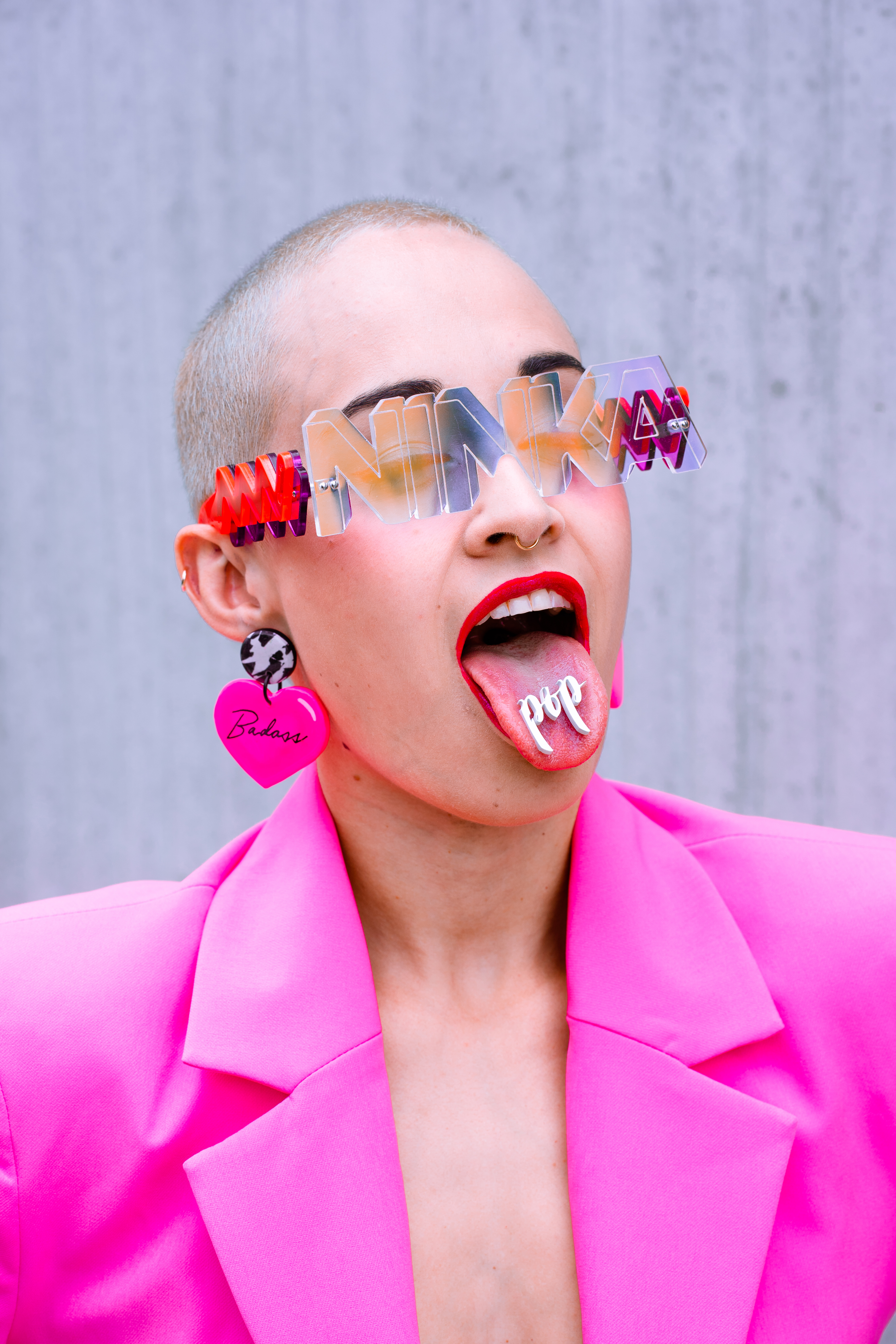
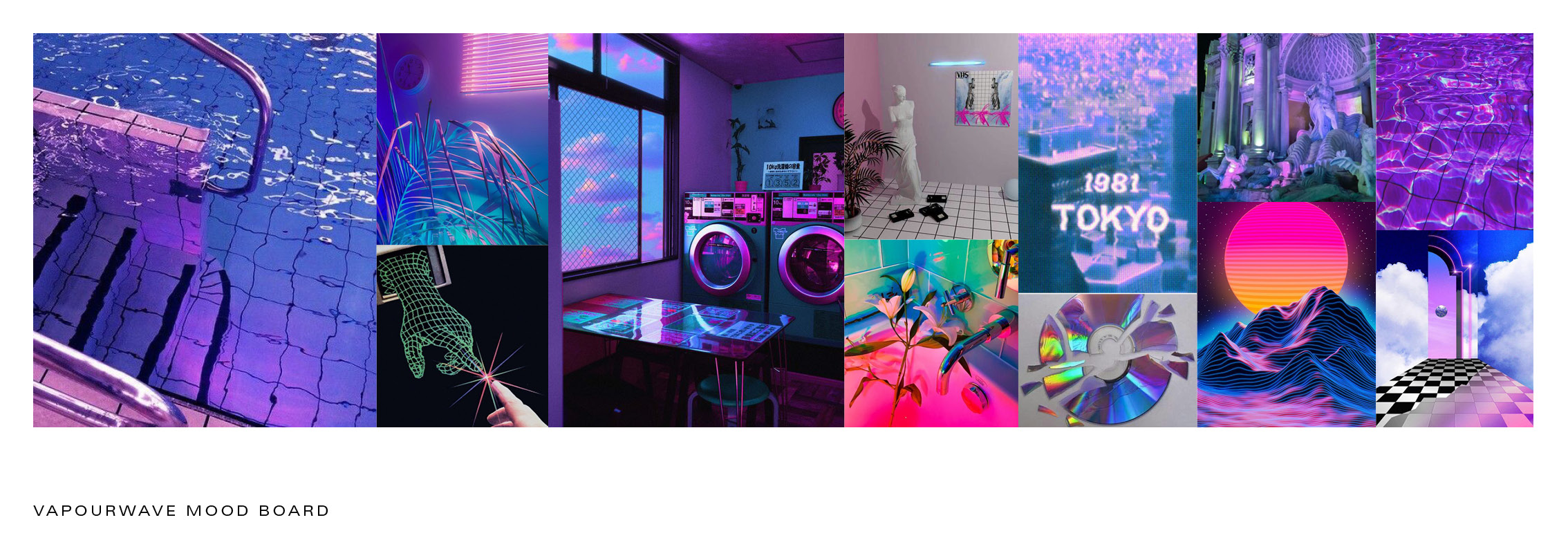
I started this project by researching Vaporwave, the aesthetic style that heavily influenced the design and branding of Ninka Pop. Vaporwave is described as “a micro-genre of electronic music, a visual art style, and an Internet meme that emerged in the early 2010s.” Through my research I discovered several motifs and nostalgic references to early 90s technology, early computer graphics, and the art of Michelangelo. I pulled this research into a mood board which became a reference tool to aid me during the ideation process.
![]()
![]()
![]() *Two vaporwave moodboards followed by one brand moodboard.
*Two vaporwave moodboards followed by one brand moodboard.

 *Two vaporwave moodboards followed by one brand moodboard.
 PROCESS / PRE-PRODUCTION
SOURCING PROPS
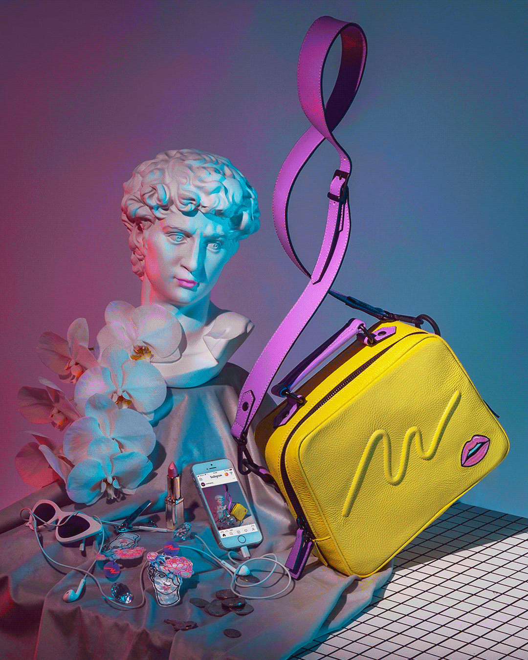
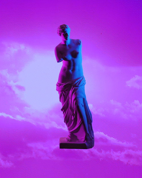
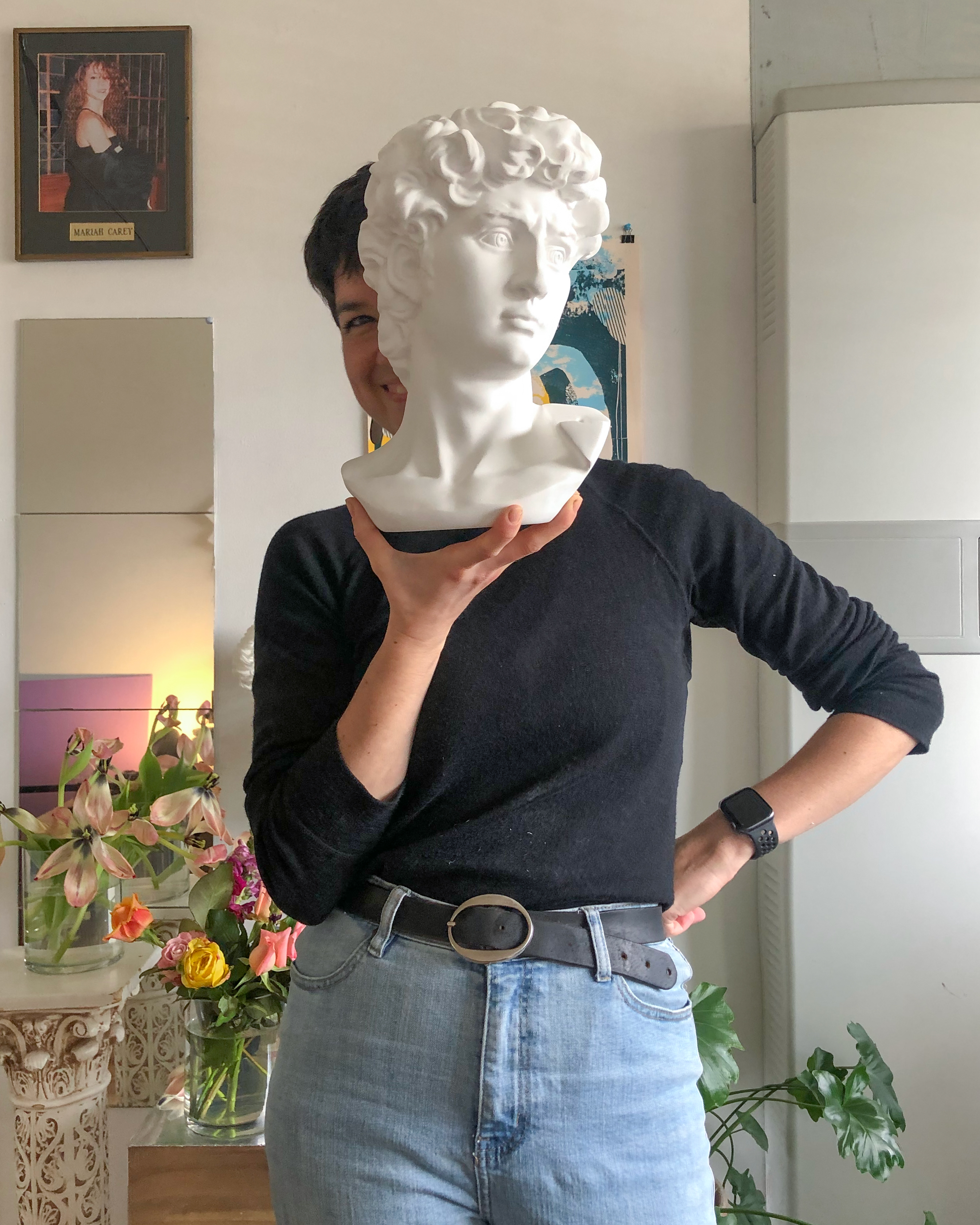
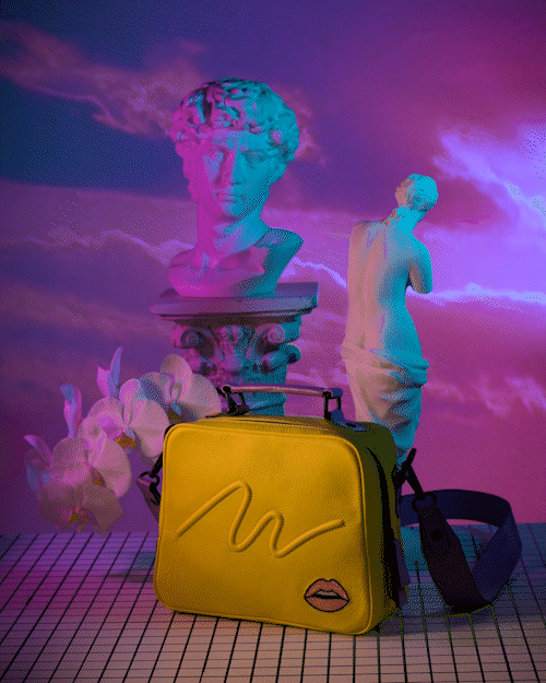
The statue of David, Venus De Milo and grid horizons in cyber space are common motifs in all of Vaporwave visual art. I wanted to include these three elements in a Windows ’98esk scene where David and Venus are accompanied by Ninka Pop products.
![]()
*Above- photo of me being very excited about the arrival of David*
I sourced two small resin statues of David and Venus De Milo, both of which were white and perfectly pristine. They were so perfect, I felt it would be a shame to alter them in anyway so the urge to keep them in their perfect state, aided me in finalising the concept of the project. In the end, I decided I would style the scene using only white objects but add colourful lighting.
PROCESS / PRODUCTION
FINAL CONCEPT DEVELOPMENT - CREATING MY OWN MOTIFS
One of the most striking features of the squiggle bag is the embroidered lip decal in the bottom right corner. This lip graphic is one of the most identifiable marks of the Ninka Pop brand so I felt it was important to build a stronger relationship between the bag itself, and this world I was creating where the bag exists. It was a challenging ideation process trying to create this visual relationship between the bag and the world but eventually I landed on this concept surrounding lips and lipstick.

It felt like I spent a millennia trying to figure out how to tie all these different objects and elements together in these images until one afternoon while staring at the earrings and the bag together I noticed that Sayra chose to paint the lips of David pink. There it was right in front of me, the very obvious element I needed to relate these products to the white Vaporwave world I was making. David’s lips in the earrings are pink, therefore, David the statue must have pink lips and the bag also has pink lips. So, in every image, there must be pink lips or I must draw attention to lip in the picture. DUH!
PROCESS
PRODUCTION
Each image required a different level of construction prior to shooting. When styling the props, I used string to create floating elements which I then removed in post production. The compositions were constructed first, then the lighting was added after.
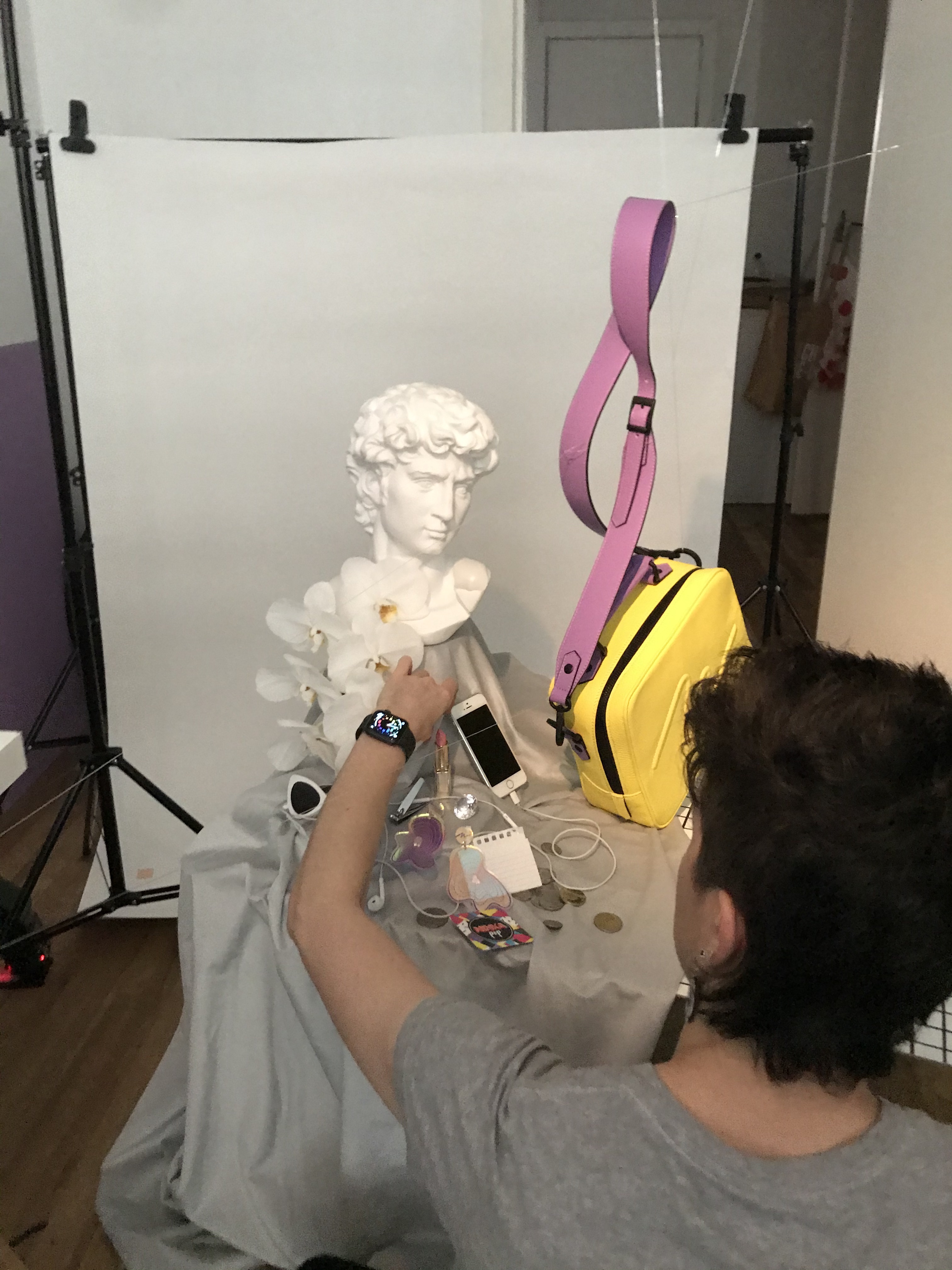

Each scene uses a very simple three light set up. Two colours, one natural light source. The two colourful light sources use umbrellas to soften the light where the key light (the natural light) is controlled using a modifier called a Snoot, which keeps the natural light focused onto the subject.

PROCESS
VIDEO
I created two videos for this project, one was made using a projected image of a sky looping behind the still life. For the other, I created x3 short stop motion videos using both of the statues and the bag. I then removed the green screen and edited the clips together resulting in a trippy bizarre vaporwavesk clip.
THE PROCESS
POST-PRODUCTION
Post-production is the final step of the process. First, images are culled, organised and ranked leaving only the necessary files needed for editing. The retouching process begins with compositing, clean-up (clone stamping and healing) then basic exposure adjustments. It is then followed by dodging/burning, smoothing and colour grading. This process changes from image to image as does the time it takes to complete each image. I am able to achieve high-quality results due to my advanced understanding of image retouching and Photoshop software.
Need product photography that celebrates the personality of your brand? Don’t be a stranger. stormypyeatte@gmail.com